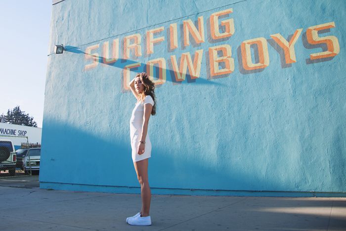
Rumi. 2013. Photographer Unknown. Fashion Toast. [Blog] Where have all the surfing cowboys gone. Viewed 28/10/14. Available at: http://fashiontoast.com/2013/11/where-have-all-the-surfing-cowboys-gone/
Now, this is definitely not a blog post you can quickly glance at to figure out what its purpose is.
The title of the blog is 'Where have all the surfing cowboys gone?' and we can see where this has come from in the image above, The building the model is posing in front of has this written on its
wall. It then starts to get a little bit confusing as you continue to scroll down the blog and come across a passage of text referring to a 'Danger Dress' which leads me to my next point, what has the outfit got to do with surfing cowboys? as to me it looks more like a tennis outfit and that is exactly how I have portrayed it, so what is the blogger trying to portray? it's very unclear as to the meaning of this photo shoot.
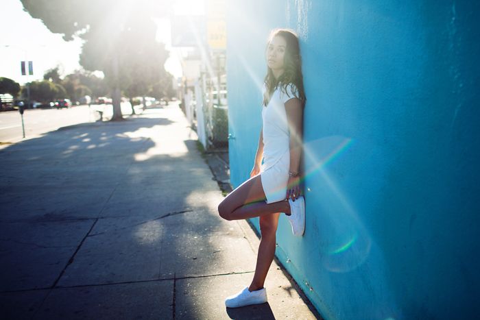
Rumi. 2013. Photographer Unknown. Fashion Toast. [Blog] Where have all the surfing cowboys gone. Viewed 28/10/14. Available at: http://fashiontoast.com/2013/11/where-have-all-the-surfing-cowboys-gone/
Here is a second image from the same blog. The title still is very unclear to me for its meaning or what part it is playing within this post. However, the reference to a 'Danger Dress' is now more relevant than it was within the post above, it now looks like your everyday fashion blogger photo or a less studio more street image to promote a brand of clothing.
Overall I don't exactly know what the blogger or writer is trying to tell us or what the story is behind this piece, I can't pin point it's relevance so I have simply written a review on how I have perceived this post to be.
Kevyn Aucoin. Date Anon. Published on Pinterest. [Web] Viewed. 25/10/14. Available at:
http://www.pinterest.com/pin/501518108475400199/
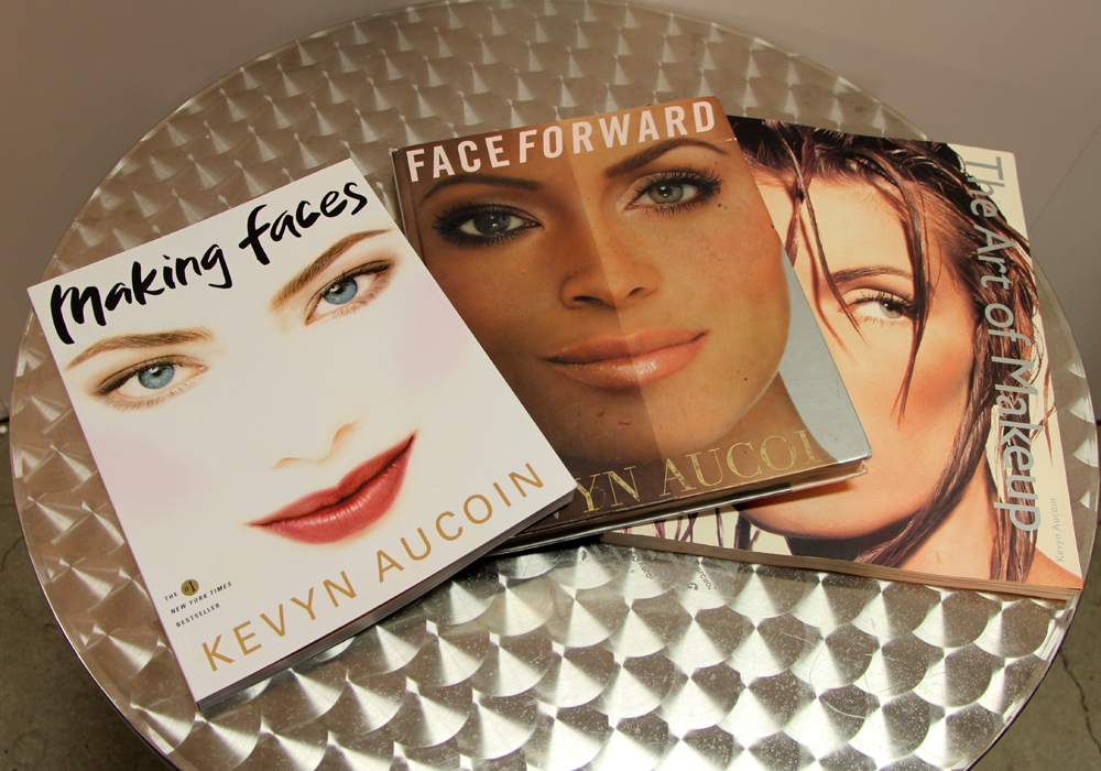
Kevyn Aucoin is one of the most influential and well known make up artists in History,
With a career spanning from 1982 till his tragic death in May 2002 at the age of just 40, he worked with some of the worlds well known celebrities including Naomi Cambell, Gwyneth Paltrow, Julia Roberts, Janet Jackson, Barbra Streisand and Cher. Kevyn was considered one of the best paid make up artists in history and was awarded the first ever Council of Fashion designers of America award for Make up Artistry.
Kevyn Aucoin's career started in New York City where he worked with models for free before landing his first Vogue photo shoot. It was his work with Cindy Crawford that really took his career off, he was given 9 Vogue cover shoots and 7 Cosmopolitan cover shoots and it has even been said that he would demand anithing upto £6,000 per booking for his services as a make up artist.
He became creative director at Revlon at the young age of 21 where he worked on their Ultima range, he then went on to launch the companies Naked Line.
Kevyn also worked with Japanese brand, Shiseido.
In 2001 a year before his sudden death he launched his own brand, Kevyn Aucoin Beauty. The brand is still around today and is used in thousands of MUA's kits.
He has left a leading legacy with his No.1 BEST SELLING books. Face Forward, The Art Of Make Up and Making Faces.
Kevyn's books are a few of the books make up artists always go to for answers,
inspiration and knowledge. Olivia Frescura. Beauty By Design [Blog] The Make Up Show LA 2014. Kevyn Aucoin Gallery Books.2014. Viewed 25/10/14. Available at:http://www.oliviafrescura.com/2014/03/05/the-makeup-show-la-2014-recap-haul-video/the-makeup-show-la-2014-kevyn-aucoin-gallery-books/
The seven photographs that changed fashion is a documentary by British portrait and fashion photographer, John Rankin Waddell. He decided to re create seven iconic fashion images that changed the way artists, designers and photographers worked forever.
This documentary is relevant because it fits in with the project were doing, we are creating modern, contemporary images of the historic portraits of Elizabeth I. The program allows us to go back in time and gives us historical meaning to the photos, explains to the viewers why this image changed the world of fashion at its time of release and allows us to understand how to re create historical images.
These images are clearly so well known, I have come across a few of these images and not realized they were this iconic! The Erwin Blumenfeld Vogue Cover is one of my most favorite images and yet I didn't know the background of this image until I watched this documentary!
Image viewed 25/10/14- Author Unknown- Photo of the cover for the documentary 'The seven photographs that changed fashion' picture available at- http://ondolady.com/seven-photographs-that-changed-fashion/
My favorite Image-
David Bailey-
David Bailey.1962. Jean Shrimpton. Photography. Digital Image. Posted on Phaidon. Viewed 25/10/14 Available at:http://uk.phaidon.com/agenda/photography/picture-galleries/2010/april/13/david-bailey-look/
David Bailey is a English fashion and portrait photographer well known for his work on so many high profile celebrities and for his extensive work in Vogue.
The image above was shot by David and the model is Jean, his girlfriend at the time of the photoshoot. This image caught my attention more than any of the other 6. There is something about Jean's beauty that captivates you and draws you in. The way shes stood, her facial expressions, her pose are all so effortless, elegant and
beautiful, The image almost makes me feel warm inside.
This image has a bit of sex appeal and with the time of its release would of caused quite a stir, which is something that got both David Bailey and Jean noticed.
Face charts are used to create a make up design, Artists use real make up and brushes to create realist designs to showcase their mood/inspiration and design ideas. Face charts are most commonly used by Make up Designers, who complete a chart followed by lots of writing stating what products were used in order for the artists to re create the look.
I have been practicing face charts and have created 2 looks based on 'Monochromatic' and 'Achromatic'
I don't think they are at all to a high standard and I think with more practice I will start to get the hang of drawing these. To do this I have been watching videos of other artists who create face charts and do tutorials to catch some tracks they use to make doing a face chart more simpler.
Here is a video I watched On YouTube.
Hagberg.J., 2013. How To Use Face Charts. Available at:https://www.youtube.com/watch?v=R9gB51iLapQ Viewed 24/10/14
During the last few years contouring has become a huge craze across the world because of a certain someone, Kim Kardashian. The world went crazy after seeing a video of her make up artist showing us 'How to look like Kim' but of course, Kim and her team didn't come up with this craze. Contouring and highlighting has been around for ever, its common use was for Drag Queens to sculpt their face to make it seem more feminine.
Scott Barnes. Kim Kardashian. Date Unknown. Viewed 24/10/14. Available at:
Contouring is an amazing way to transform ones face, with the use of dark cremes and powders around 2 shades darker than your normal skin color, you can make your face appear more structured by creating a shadow or more depth.
Jaw lines and cheek bones are stronger, the nose is slimmer, lips are plumper and the forehead gets smaller. These are some of the things this amazing trick can do, and that's exactly what it is! we trick a persons eye and the lens of a camera to think that our face is more structured and perfect than it actually is. So clever!
Its not all that easy, knowing the structure of the bones in our face really helps you to contour correctly, especially when we come across different faces everyday! we are all different.
Highlighting-
Highlighting is the opposite to contouring, instead of creating depth in the face we want to highlight our best features and bring them forward.
Highlighting is a skill also popular because of Kim K but again, wasn't founded by her and her make up artists. Highlighting is when you take a lighter creme/powder product 2-3 shades lighter than your skin tone, you then apply this to the bridge of the nose, cupids bow, the brow bone, forehead and the cheek bone, this then creates a healthy glow to the face and brings out those features.
So, contouring isn't just for beauty shoots, celebrities and drag queens as mentioned above, Artists use this technique to transform actors into characters and even other people! The abilities an artist has when they have mastered this technique is amazing, for example Angelina Jolies 'Maleficent' was created with the use of prosthetic's and contouring.
Here are a few examples of contouring and highlighting I have done..
Two subtle contour and highlights mainly on Cheek bones.
We all have those hard to cover dark circles under our eyes after lack of beauty sleep so being able to hide that with make up is marvelous!
To correct discoloration in the skin whether it be dark circles, pigmentation problems or redness your new best friend is the color wheel/color theory and that insanely good concealer in your kit! To banish the problem areas in your skin you must must must! have an amazing concealer in your kit (for Me it's- Dermacolor camouflage creme by Kryolan)
Skin correcting works by the use of the color wheel, dark circles tend to be of the following colors, BLUE, PURPLE AND GREY so to cancel out those colors you need the color opposite it on the color wheel. This is known as a 'Complimentary colour'
Here is an image of the infamous color wheel! Dark circles are mainly in the blue/violets category so their complementary color would be? Oranges/Yellows. This image allows me to check back and ensure I color correct, correctly. Image available at- MIY Masters. Website. Date Anon. Viewed 24/10/14. Available at:http://miy.masters.com.au/image/colour-wheel
To apply concealer to skin correct you must do so before foundation, apply to discolored areas ONLY and use a regular skin matched foundation after. If you need any more concealer after your foundation you can do so by using a concealer that suits your skin type.
Base Application-
There are so many different foundations on the market it almost seems impossible to choose one, however you shouldn't just use any old foundation you MUST have a foundation that not only matches your skin color but your skin type as well.
Different foundations types-
-Liquid based
-Oil based
-Water based
Different foundation textures-
-Matte
- Sheer/Luminous
-Satin/Velvet
You can also choose what kind of coverage you would like, This is how visible it is on your skin to the naked eye
Different foundation coverage's are either-
-Invisible/Light coverage (No make up, make up look!)
-Medium coverage (more for your everyday use, covers uneven skin and blemishes)
-Full coverage (extremely heavy and used to cover scars, birthmarks, tattoos etc)
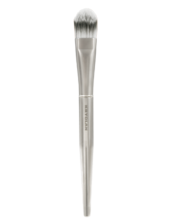
To apply your foundation you must first have prepped your skin (Cleanse, tone, moisturize)
and have applied a suitable primer and if needed, ensure skin correction is complete. Once this is done you then take a flat foundation brush like pictured below and work your product into the skin. For me I start from the nose and work my way outwards to the hair line. After I use a stippling brush to ensure my products fully blended in and even.
(image of brush owned by Kryolan/Charles Fox and was found via their official website at- https://uk.kryolan.com/product/premium-foundation-brush)
After finishing your foundation you can then apply your concealer if necessary.
You then must SET your foundation using a translucent powder and a Powder brush.
Rae Morris- 'Express Make Up' Book
Morris, R., 2008. Makeup: The Ultimate Guide, Pages 160-167. Viewed 24/10/14.
Rae Morris's book is extremely helpful in informing readers about different product properties and even has a list of what you should have in your kit! Not only that, it holds lots of different looks you can be inspired from and goes into detail on How to do different make up applications. I have taken photos of these pages as a reminder to look back. All text and images are from Rae Morris, Express Make Up book. Available in the library.
Here is a before and after picture of my skin after being color corrected under the eyes with Kryolan Dermacolor camouflage pallet and Estee Lauder Double Wear foundation in Fresco. Image taken by myself/Makeup done by myself.
Pinterest. Erin Bailey. Clothes. Date Anon. Viewed 20/10/14. Available at:http://uk.pinterest.com/pin/45106433738558153/
This image is a modern take on Traditional Elizabethan fashion, hair and make up.
This image visually engages me due to its close similarity to the traditional look.
I have made here a collage of my 6 favorite Modern takes on Elizabethan makeup.
These images have all taken a different path when the artist was designing the looks. Some images are Avant garde, some are standard beauty and some are high fashion. All these images show me the versatility I have when designing my own 'modern Elizabethan' its shows me I don't have to be 100% historically correct but I just have to incorporate certain things so my viewers can recognize where my inspiration came from and that they can connect it to the Elizabethan Era.
Images that show STATUS and WEALTH.
Elizabethan portraiture often provides us with the knowledge of the sitters status, are they wealthy? do they have that ideal beauty that we can connect this status too? are they poor? All these portraits are able to show us this. I have found a few modern images that show a persons wealth and status within an image.
I cant control my obsession with Kim Kardashian (Sorry Sharon) which is probably why I chose this picture but for people who don't know Kim and Kanye would look at this image and instantly assume 'These people are wealthy', why? because of the Private jet. Vogue Magazine. Kim and Kanye Interview. 2014. Viewed 20/10/14. Available at: http://theybf.com/2014/03/24/kim-kanye-north-more-pics-from-%E2%80%98vogue%E2%80%99-spread-released
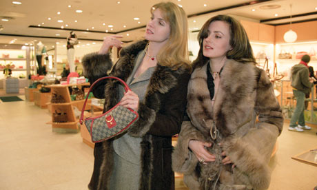
Here, is another image of two women who you would instantly perceive to be Wealthy, why? The designer handbag and big fur coats. A woman's dress sense can usually provide a great amount of information about their lifestyle. Guardian. Article. Russia's Rich.2011.Viewed 20/10/14. Available at: http://www.theguardian.com/world/2011/apr/11/russia-rich-richer-poor-poorer]
Elizabethan Portraiture My Favorite Image National Portrait Gallery, London.
The Phoenix
This image is on display at the National Portrait Gallery, London.
Sitter- Queen Elizabeth I
Artist- Nicolas Hilliard
Date- 1575
Type- Oil on panel
Size- 32inch x 24inch The Phoenix. Nicholas Hillard. 1575. Queen Elizabeth I. National Portrait Gallery London. Viewed 20/10/14. Available at:http://www.npg.org.uk/research/programmes/making-art-in-tudor-britain/the-phoenix-and-the-pelican-two-portraits-of-elizabeth-i-c.1575.php
I did not make the trip to London to visit this incredible gallery so I have been saved by the internet, specifically the National Portrait Galleries website. This image was one of 12 in my search, and instantly jumped out at me. The vibrant red and gold caught my eye first and these colours are so appealing to the eye. The second reason this portrait stood out for me, is the ideal beauty it portrays, Also Elizabeth was known for her elaborate dresses and jewels, and this portrait really backs that opinion. The jewellery she is draped in is timeless.
The overall mood of this image isn't really clear, in all the portraiture I have seen Elizabeth never shows any emotion, she is numb. Her body language however speaks volumes, she's stood very bold, tall and elegantly which gives me the impression she wants to make sure the viewers of this portrait remember she IS the Queen of England. The way she gently holds the rose in her hand is beautiful and is one of many focal points on this image for me. The rose is symbollic in this image because..
The clothing Queen Elizabeth is wearing clearly tells us of her class status, which if it wasn't already obvious with her being Queen Of England, her class was Upper class/High Class. Her physical characteristics also tell us her class status, Her face is white and lips red with fair short hair. This description is what was classed as Ideal Beauty in this era and only the upper class could achieve such beauty.
M.C Gillis. Colour Theory.2003-2006.Online Image. ABC'S of colour theory.Viewed 17/10/14. Available at:http://awesomeartists.com/ART/mTheABCsOfArtColorTheory.htm
Definition of colour theory-
'Colour theory is in the visual arts, a body of practical guidance to colour mixing and the visual effects of a specific colour combination. There are also definitions of colours based on the colour wheel, these Primary Colours, Secondary Colours and Tertiary Colours' Google. Definition. 17/10/14. Available at:
'is the choice of colours used in design for a wide range of media. Colour schemes are used to create style and appeal'
[information from notes from seminar with Kat Vogart]
Definition of Colour Wheel-
' Colour wheel or colour circle is an abstract illustrative organisation of colour hues around a circle that shows relationships between primary colours/tertiary colours etc..'
[information from Notes from seminar with Kat Vogart]
[Image of notes from seminar with Kat Vogart]
Colour Context-
Is the interaction of colour and how the colour behaves in relation to colours and shapes
Colour Harmony-
In visual context and experiences, harmony is something that is pleasing to
the eye
Describing colour-
Light, Dark, Pale, Matte, Shiney, Satin, Deep, Dull, Intense, Muted, Clear, Cool, Warm, Dynamic. All these describe colour.
Defining colour- Lightness (Light VS Dark or White VS Black)
-Saturation (Intense VS Dull)
- Hue
[All information (from colour context) above are from notes taken during seminar with Kat Vogart/ Image of notes]
Understanding Colour-
I find watching videos helps me understand things alot better. Here is a video by Andrew Price explaining colour. He touches on Colour hues, Saturation, Primary and secondary colours, Monochromatic colour, Complementary colour and Tetratic colour. He explains all relevant information for beginners in great detail
He also has posted a written version of this video for quicker reference- Andrew Price. Understanding Colour. 2014. YouTube. Viewed 11/10/14. Available at:https://www.youtube.com/watch?v=Qj1FK8n7WgY
Saturation/Value-
Blend Guru. 2014. SaturationandValue. Online Post. Official Website. Andrew Price. Viewed 17/10/14. Available at: http://www.blenderguru.com/tutorials/understanding-colors/#.VEDu4fldWSo This image is relevant for visually showing me what saturation and value is within colour] 'Value and saturation play a huge part in an image. Too much saturation in more than one colour can irritate and annoy the viewer because they have not got anything to focus on and to work themselves around the whole image, instead they are temporarily blinded by this huge use of colour. Images that use different percentages of saturation are proven to invite a viewer and is very pleasing to the eye. Value as stated above is the brightness and darkness change in one colour. Changing the value in an image can create depth and is much more pleasing to the eye than one solid colour. Both of these can be used in 'Monochromatic colour' also. At 20% value, red becomes a dark muddy brown. In fact just using the color red as a starting point, you can create these shades simply by changing the saturation and value. The shades created are above' Blend Guru. Andrew Price. 2014. Official Website. Viewed 17/10/14 Available at: http://www.blenderguru.com/tutorials/understanding-colors/#.VEDu4fldWSo
Monochromatic Colour- Monochromatic colour is simply the use of one colour. To use this and to use is effectively you simply choose a colour, and change the saturation/value of the colour and you then create a whole pallet of different shades. Monochromatic colour is one of the most common way to use colour mainly because people are scared of colour, the use of one colour in different shades is considered 'Safe' Monochromatic Colour.2012. Day 5, Colour 101. Story About Home. Lindsay Porter. Viewed 17/10/14. Available at: http://www.thestoryofhome.com/2012/10/day-5-color-101.html
Complementary Colour-
Complementary colour is also very popular. The use of two colours on opposite sides of the colour wheel which really suit eachother. Watching the video above, Andrew Price taught me that the use of equal amounts of each colour will create an ugly photo and that you should choose one colour that makes a bigger appearance and another that stays in the background or to create splashes of interest on an image as this will naturally please the eye. Complementary Colour.2012. Day 5, Colour 101. Story About Home. Lindsay Porter. Viewed 17/10/14. Available at: http://www.thestoryofhome.com/2012/10/day-5-color-101.html Analgous Colour- Analogous colour is the use of colour that are next to eachother on the colour wheel. Andrew Price said in his video that its mostly seen on images of nature, creating a calm, comfortable and peaceful mood.
Analogous Colour. 2012. Day 5, Colour 101. Story About Home. Lindsay Porter. Viewed 17/10/14. Available at: http://www.thestoryofhome.com/2012/10/day-5-color-101.html Achromatic Colour- Achromatic colour is a colour spectrum consisting of Black, white and different shades of grey. These are not normally referred to as a 'colour' and achromatic means 'free from colour' Another colour scheme which is the exact oposite of achromatic colour is chromatic colour which is made up of any colour other than black, white and grey. Here is an example of a Achromatic colour scheme. Apart from the plants on the table this image is solely made up of black, white and greys. Posted By Luke Chu. Pinterest. Dream Home. BrightBoldBeautiful. Date Unknown. Viewed 17/10/14 Available at:http://www.pinterest.com/pin/383580093234561839/]
Primary Colours- Primary colours are Red, Yellow and Blue. These colour hues are able to be mixed to create other colours. Secondary Colours- Secondary colours are Green, Orange and purple formed by mixing primary colours these hues were created. Tertiary Colours- Tertiary colours are Yellow-Orange, Red-Orange, Red-Purple, Blue-Purple, Blue-green and Yellow-green Understanding Colour Theory. Practical Commerce. 2011. Drew Coffin. Article. Viewed 17/10/14. Available at: http://www.practicalecommerce.com/articles/3247-Understanding-Color-Theory Where did colour theory come from? Sir Issac Newton a Philosopher and mathematician developed the first colour theory diagram in 1666. Since then many other scienstists and artists have designed lots of different variations of this diagram. Godfrey Kneller. Sir Issac Newton.Online Image. 2009. The Library Table. Viewed 17/10/14. Available at: http://www.thelibrarytable.com/2009/08/25/newtons-experiments-with-light-and-color/
My Fave Products to prepare or unprepare the skin!
SIMPLE!
Sadly, I missed a practical session on Skin Preparation. I have since spent time researching and watching videos online to make sure I'm up to standard.
During my last make up course we had to prep the skin before every application we did so I already have some knowledge, however I still believe that as a make up artist we are constantly learning so I still thought it was necessary to research and practice.
Before you apply make up to a clients skin its critical that you ensure the base you are going to be working on is clean and ready for the application. There are 5simple steps you must do as a Make up artist...
Skin Consultation-
* Ask your model if they have any allergies or sensitive skin*
*Ask your model if they are currently taking any medication*
*find out your models skin type.*
Products you will need; Cleanser, Toner, Moisturizer (ensure you have suitable for all skin types i.e Oily, Dry, Sensitive)
Cotton pads/cotton wool
Eye Make up-
To remove eye make up ensure your model is comfortable with you gently pressing on their eyes. Use a cotton pad and Eye make up remover (for sensitive eyes) and hold onto the eye, leave for a couple of seconds and gently pull down towards the cheek. Use a second pad to remove any eye makeup under the eye (have your model look up so you can get all make up removed) Finally, use a third pad to remove any excess make up from around the eye.
Cleanse-
Cleansing the skin is very important, it removes dirt and breaks down anything that is on the skin (last nights make up! we've all been there)
Using a generous amount of cleanser applied to your cotton pads or wool and gently work into the skin taking particular attention to those hard to reach places like the nose (this area is prone to breakouts and blackheads)
DON'T just cleanse your face, work the cleanser into the jawline and use upward motions on the neck.
Toner-
Toner is just as important as cleansing your skin. Toner will remove any excess oil or remaining make up that the cleanser didn't as well as tightening the skin and tightening pores.
To tone the skin do the same steps as you did to cleanser, remember not to over soak the cotton pad or wool. Keep out of your models eyes.
Moisturize
Now, I tend to have combination skin that gets extremely oily during the summer. I always thought that moisturizer would make this worse it doesn't! there are so many different types of moisturizer available on the market and its critical that you choose the correct one. For a model who has oily/combination skin you would use a light moisturizer and use a small amount where as for a model who has dry skin you would use a more heavy moisturizer and apply a larger amount. Moisturizer will protect your skin from the sun and create a base for your make up.
Pixiwoo. Caroline Hirons. Online Beauty Blog. Youtube. Body Talk Daily. May 2013. Viewed 11/10/14 Available at: https://www.youtube.com/watch?v=e3tRjufnWr8
This video is by Pixi Woo who are incredibly well known women in the make up industry. They have 2 YouTube channels specifically for Makeup, hair, fashion and all things beauty! I came across this video with skin expert Caroline Hirons who goes into detail about skin care routines. This video is alot more in-depth than what make up artists will do prior to a shoot due to time but I thought this was brilliant and has educated me about my own skin.
'Its like you guys applying eye shadow on this table, its not prepped' Caroline Hirons. May 2013. Body Talk Daily. Youtube. Pixiwoo. Viewed 11/10/14. Available at: [https://www.youtube.com/watch?v=e3tRjufnWr8
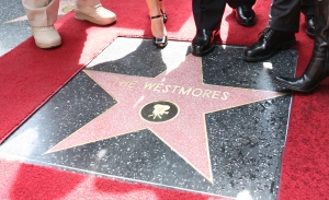
[Online Blog] Image viewed 11/10/14. Available at: http://westmoremuseum.wordpress.com/category/westmore-star/
The Westmore’s were and still are one of the most famous families
in Hollywood, serving the film industry as makeup artists for 4 generations.
Their story started with George Westmore, a British man who immigrated to the
states with his family.
In 1917 George founded the first ever make up department
in Selig Studios after realising that actors and actresses were damn right awful at
doing their own make up for TV and Film. After the success of his first make up
department he went on to freelance in the makeup and hair industry where he worked
on some of Hollywood’s biggest stars. After George’s death 6 out of his huge
family of 19 children carried on his legacy. Monte, Perc, Wally, Frank, Ern and
Bud went on to work as Makeup artists throughout the Golden age of Hollywood.
In 1921 Monte became actor Rudolph Valentino’s sole makeup
artist after the star had been doing his own makeup for film, then in 1926 Monte,
Perc, Ern and Bud became chief makeup artists in 4 of Hollywood’s major
studios.
In 1923 Perc established an amazing career at Warner Bros
and over a period of 27 years he worked on films creating beauty and special
effects for films such as the Hunchback of Notre Dame, The Private Lives of
Elizabeth and Essex.
Wally and Frank worked
at Paramount studios doing makeup from 1926, here he worked on numerous films
including the incredible transformation of Dr Jekyl and Mr Hyde.
Bud led universal studios makeup department for 23 years where he specialized in Special Effects. The brothers built the house of Westmore salon on Sunset Boulevard, Los Angeles. A business that would always be remebered. The salon went on to serve more of the biggest name like Lauren Bacall and Bette Davis. Later generations of the Westmore family have continued with the legacy including Michael and Marvin who specialised in special effects.
Wally Westmore. Audrey Hepburn. Date Anon. Pinterest. Viewed 11/10/14. Available at:http://www.pinterest.com/pin/222083825348008678/
Scott Essman. Westmore Family Tree. Makeupmag. Issue 17. March 1999. [Magazine Image] Viewed 11/10/14. Available at: http://makeupmag.com/article/id/536/
Hunchback Of Notre Dame. Artist Perc Westmore. Warner Bros. Posted 2011 on Blogspot. [Online Blog] A Blog About Old Life and Movies. Viewed 11/10/14. Available at: http://via-51.blogspot.co.uk/2011/05/cmba-movies-of-1939-blogathon-hunchback.html
House Of Westmore- Salon Of Beauty. [Online Image]. Posted 2011. Flickr. Patricksmercy. Image Viewed 11/10/14. Available at: https://www.flickr.com/photos/65359853@N00/6315003145/
During this unit in order to gain the relevant knowledge about the Elizabethan era I will be watching films based upon this era, how its adapted to suit the directors style or the time of the release of the film. This will allow me to learn the most accurate and least accurate film adaptation which will help me with my designs for our live assessment.
1. Elizabeth I 1998 Elizabeth. 1998. DVD Cover. [Dig Image] Viewed 10/10/14. Available at
'The story of Elizabeth's ascendancy to the throne, the plot of the movie is full of palace intrigues, attempted assassinations and executions. The movie starts with England divided by faith, Protestant vs. Catholic. The queen, Mary Tudor has no heir and her Catholic supporters fear the succession of her half-sister Elizabeth, a Protestant. They convince the queen to have Elizabeth arrested and put in the Tower of London but the queen hesitates and eventually refuses to sign her death warrant. It is announced that the queen is pregnant but it turns out to be a tumor and she dies of it a while later. Her Catholic supporters are forced to give the throne to Elizabeth. Elizabeth's first few years are shaky as she is not versed with the art of finesse and "rules from the heart instead of the mind". There is also the question of her succession as she is yet unmarried and her death without heir would mean the throne falling back into Catholic hands. She has many suitors but she eventually rejects them all. And aided by Sir Francis Walsingham she manages to kill all her enemies and ascends the throne as the "Virgin Queen". Elizabeth. 1998.[film] Storyline. Directed by Shekur Kapur. Passage viewed 10/10/14. Available at: http://www.imdb.com/title/tt0127536/synopsis?ref_=tt_stry_pl
images taken by myself from Elizabeth film. 1998. Shekhur Kapur. 10/10/14.
Elizabeth was made in 1998 directed by Shekur Kapur. Staring Cate Blanchett, Geoffrey Rush and Richard Attenborough. This film was beautifully written and I believe it showed not only the darkness surrounding Queen Elizabeth's early reign with her life in danger and the harsh reality that surrounded her but it showed her romance, her fun side, her feminine side and most importantly to the time her strong willed personality.
Make Up Artist Anita Burger.
2-
Elizabeth I The Golden Age 2007
Elizabeth: The Golden Age. 2007. DVD COVER. Shekur Kapur. 10/10/14. Available at: http://cf2.imgobject.com/t/p/original/3FmfviENv7WkWWPaY3Y2lHAXlEA.jpg
'Two faiths, two empires, two rulers - colliding in 1588. Papist Spain wants to bring down the heretic Elizabeth. Philip is building an armada but needs a rationale to attack. With covert intrigue, Spain sets a trap for the Queen and her principal secretary, Walsingham, using as a pawn Elizabeth's cousin Mary Stuart, who's under house arrest in the North. The trap springs, and the armada sets sail, to rendezvous with French ground forces and to attack. During these months, the Virgin Queen falls in love with Walter Raleigh, keeping him close to court and away from the sea and America. Is treachery or heroism at his heart? Does loneliness await her passionate majesty? ' Elizabeth: The Gold Age. 2007. Story Line. Shekur Kepur [Film] Viewed 10/10/14. Available at:http://www.imdb.com/media/rm3244069632/tt0414055?ref_=tt_ov_i-
My review- Elizabeth I The Golden Age was made in 2007, directed by Shekur Kapur. This film follows on from Elizabeth (1998) film. The movie focuses on the Queens reign in her later life, mostly the dark times she went through like her Assassination plot, The war with the Spanish and her failed love, with explorer/pirate Walter. Walter impregnated and married one of her court ladies without the Queens permission ordering his arrest. As the war with the Spanish started Elizabeth 'Forgave' Walter and ordered his release.
Make up Artist- Sharon Holloway (crowd MUA), Joe Hopker and Susan Howard
The Actress, Cate Blanchett played Elizabeth I in both of the films above. She gained numerous award nominations for her role in these films.
Interview. Cate Blanchett. 2007. Manny Del Rosa. Hosts YouTube. Viewed 10/10/14. Available at: https://www.youtube.com/watch?v=36ksZaaE9Bc]
The Virgin Queen. [Film Cover] 1955. Bette Davis. Viewed 10/10/14. Image Available at:
'Sir Walter Raleigh overcomes court intrigue to win favor with the Queen in order to get financing for a proposed voyage to the New World. Sir Walter Raleigh gains audience with Queen Elizabeth I and soon wins her over to his way of thinking. He wants ships to sail and make a name for England. A young ward of the court, Beth Throgmorton, is strongly attracted to Raleigh and returns the attraction. But soon the Queen shows her desires and he bends in order to achieve his goal of ships. But still he loves Beth'
Author Anon. The Virgin Queen. [Film Story Line] 1955. Viewed 10/10/14 available at:
http://www.imdb.com/title/tt0048791/]
Bette Davis went above and beyond to play the role of Elizabeth. She was considered one of the most beautiful women in Hollywood but then, she plucked her hairline back and removed her eyebrows just to play this role to the best she could.
Make up Artist- Perc Westmore (Bette Davis only) and Ben Nye
Before..
Owner Anon. Amazon. The Bette Davis Collection. [DVD COVER. Viewed 10/10/14. Available at: http://www.amazon.co.uk/Bette-Davis-About-Charlotte-Virgin/dp/B000E6UXIE
After..
Bette Davis. Artist Anon. Listal [Online] On 23rd July 2012.Viewed 10/10/14. Available at:http://www.listal.com/list/the-virgine-queen-sfg Poster- SFG?MYSTIC
The Virgin Queen. [Online Video Trailer] Posted By Dave B. 2012. Viewed 10/10/14. Available at: https://www.youtube.com/watch?v=96Xzh9pqE84
BBC. Elizabeth I: The Virgin Queen.2005 [DVD FRONT COVER] Viewed 10/10/14. Available At:http://www.imdb.com/title/tt0481459/?ref_=nv_sr_1
4. The Virgin Queen 2005
'The Virgin Queen explores the full sweep of Elizabeth's life: from her days of fear as a potential victim of her sister's terror; through her great love affair with Robert Dudley; into her years of triumph over the Armada; and finally her old age and her last, enigmatic relationship with her young protégé, the Earl of Essex. A Exhilarating TV series' The Virgin Queen. 2005. [Film Story Line] Author Anon. Hosted by IMBD. Viewed 10/10/14. Available at: http://www.imdb.com/title/tt0481459/?ref_=ttvi_tt
Makeup Artists-
Make Up Artist Crew List. Elizabeth The Virgin Queen. BBC. 2005. IMBD. Viewed 10/10/14. Available at:.http://www.imdb.com/title/tt0481459/?ref_=nv_sr_1


.JPG)
.JPG)


.JPG)
.JPG)
.JPG)
.JPG)
.JPG)
.JPG)


.JPG)
.JPG)


.JPG)


.JPG)
.JPG)


